top of page

Crafting meaning through logos and brand systems.
Logo Design

OLD DESIGN
NEW DESIGN
POLYMAXX
Concept : Redesign of existing logo using golden ratio and modern design principles to enhance balance, proportion, and visual harmony.
Focus : Revamping brand identity while keeping its legacy intact.


GOLDEN RATIO


CLEAR SPACE
INCORRECT USAGE OF LOGO


This poster showcases the logo design in its full visual identity form — highlighting the brand’s essence, color psychology, and balanced composition.

To strengthen brand identity, I designed premium packaging tins featuring the brand logo.

To extend the visual identity of the brand beyond the logo, I designed a cohesive set of stationery that reflects the brand’s personality and professionalism.


STANDARD VERSION
STACKED VERSION


K2Arma
Concept : Redesign of existing logo using golden ratio and modern design principles to enhance balance, proportion, and visual harmony.
Focus : Revamping brand identity while keeping its legacy intact.


Other Concept Proposals


Our packaging design proudly features the logo as the central visual element, reinforcing brand identity and recognition.

This version of the logo is showcased in a single color palette, highlighting its adaptability and clarity.

Our logo represents the essence of our brand — a blend of creativity, clarity, and purpose.
STANDARD VERSION

STACKED VERSION

Jeevan Rekha
Concept : Designed for a medical retail store, named after the client’s mother — symbol of life and care.
Meaning: “Jeevan” (life) and “Rehka” (line) embody health, trust, and continuity of life.


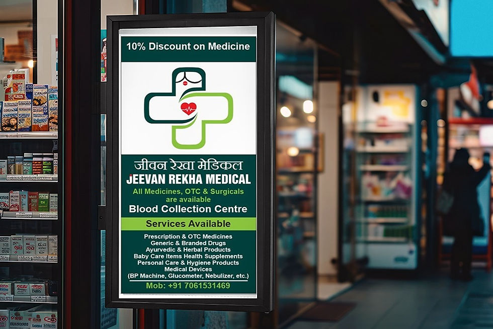

The logo has been successfully Implemented in a real-world setting as part of a retail medical shop banner, showcasing its practical and visual impact in a commercial environment

Let's Connect
Proudly designed by G.Narsimha Swamy
bottom of page