
Branding & Packaging Design
Transforming stories into shelf impact.
Design Inspiration – “The Science of Bonding”
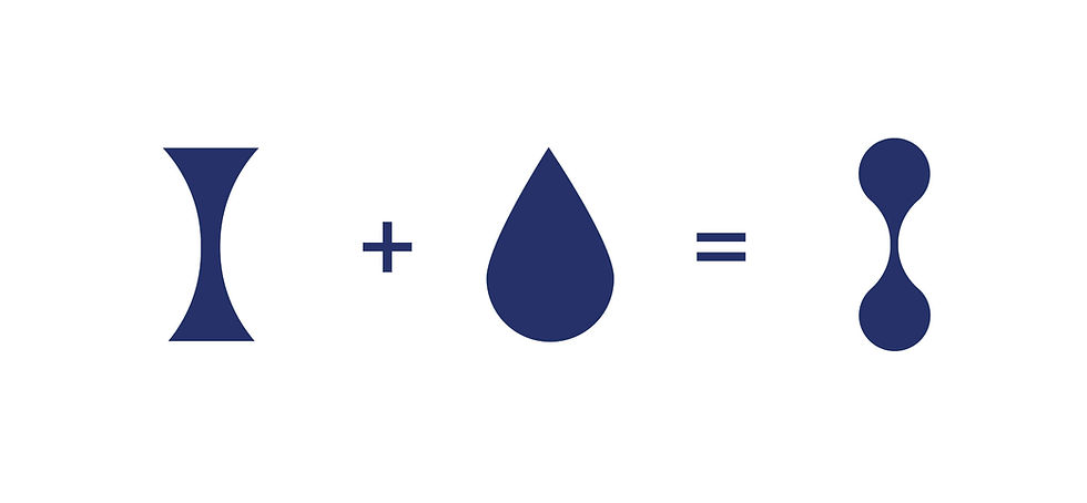
The core inspiration for the Polymaxx packaging comes directly from the natural behavior of adhesives themselves. While observing how adhesives stretch, form filaments, and connect between surfaces, a very distinct visual pattern appears — a necking shape created when adhesive is pulled, forming a narrow center and rounded ends.
This organic form, highlighted in the reference image, became the foundation of the design language. The mascots represents the powerful, unbreakable bond between a father and son, symbolizing ultimate protection and enduring attachment.


Mascot - Bear Hug

D2C Business
Polymaxx AR – Multi-Purpose Craft Adhesive
A versatile adhesive similar to Fevicol MR. I designed the packaging and label with a clean, friendly look to highlight its everyday use for paper, craft, and fabric bonding.
Polymaxx 360° – Strong Rubber-Based Adhesive
A high-strength adhesive similar to Fevibond. I created a bold, industrial packaging and label design that reflects its durability and professional bonding performance.


Glue Stick
The packaging uses bright, high-contrast colors (yellow, green, blue) to clearly differentiate each variant—Klassic, Smart, and Buddy—making them easy to पहचान at a glance. The bold, playful typography and glue-splash graphics instantly communicate the product category and make it kid-friendly.

Glue Stick Range
Packaging Artwork


New Packaging
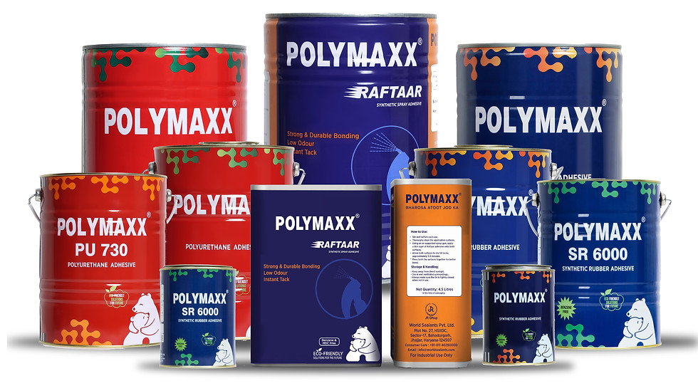
The new tin Polymaxx packaging is built as a single design system that fits both B2B and D2C needs. The red–green for PU grades and blue–orange for SR grades palettes create clear product differentiation and complement each other visually.
The colors also honour the Bihar labour community — red for energy and devotion, blue for Chhath Maiya, the river and sky.


Old Packaging
The older packaging lacked a strong brand identity, modern appeal, and cohesive visual language. It served its purpose in communicating product information but offered limited shelf impact and brand differentiation.

Polymaxx Core Range


BRAND DECK
REDEVELOPMENT
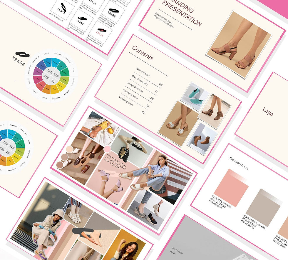
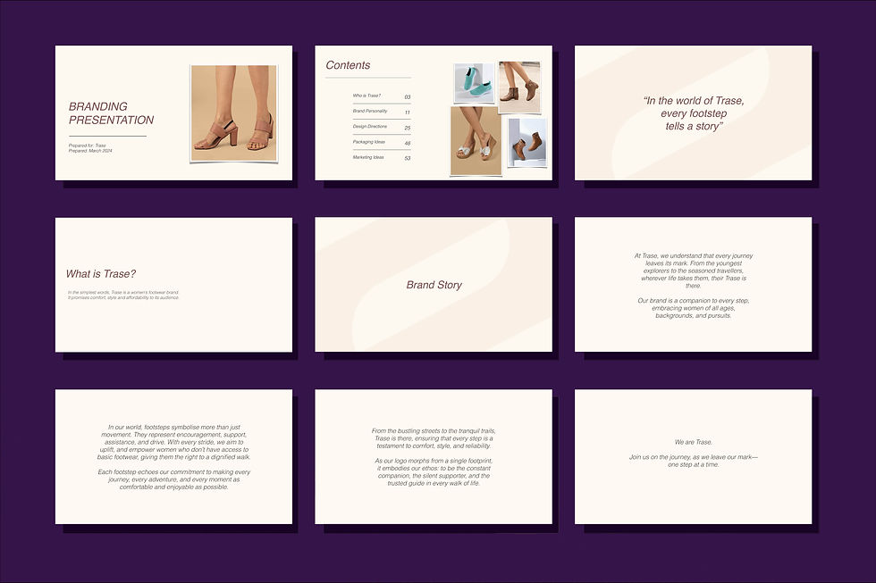
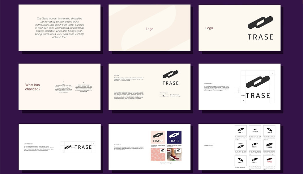
Redeveloped the complete brand deck for Trase, refining and modernizing its visual identity system. The updated deck includes enhanced guidelines on logo usage, color palette, typography, iconography, and layout structure. It also refreshes the brand’s visual tone, communication style, and content direction to create stronger consistency across digital platforms, marketing materials, and product communication.
This redeveloped brand deck acts as a strategic design foundation that elevates Trase’s presence and ensures a cohesive and impactful brand experience across all touchpoints.
TRASE
2024
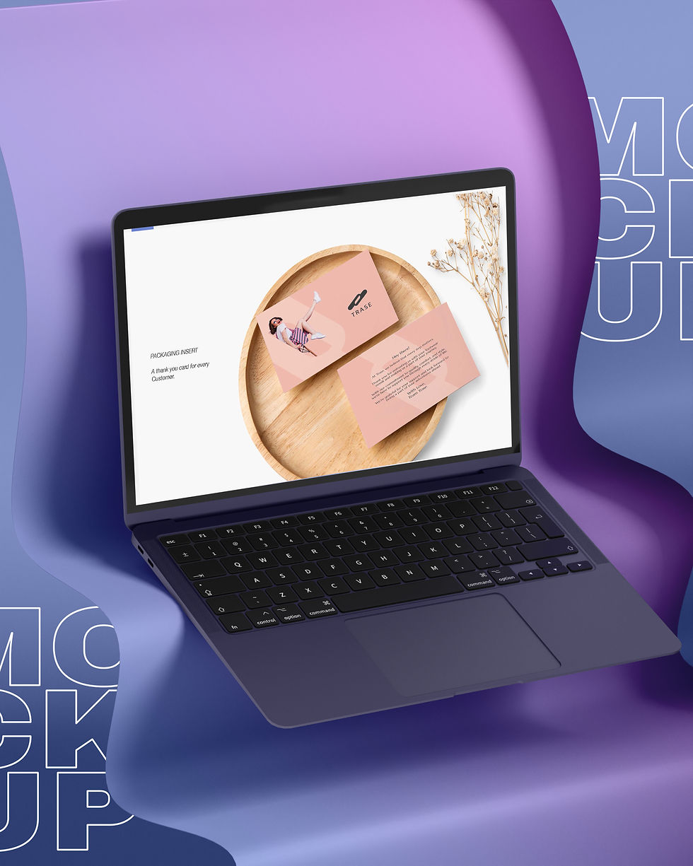
An overview of Trase’s brand story, values, purpose, and tone—setting the foundation for all design decisions.
The Deck
The Trase Brand Deck is a structured guide that defines every element of the brand’s visual and communication identity.


Visual Elements
Redesigned icon styles, graphic elements, patterns, and shapes that build a cohesive visual language.


Let's Connect
Proudly designed by G.Narsimha Swamy